10 Things Every Financial Services Brand Must Have on Their Website
In the financial sector, trust is currency. But in 2025, your handshake doesn’t happen in a boardroom – it happens on a screen.
For banks, wealth managers, and insurers, the stakes are incredibly high.
A confusing navigation structure doesn’t just annoy a user; it could mean losing their life savings to a competitor. A slow-loading page doesn’t just increase bounce rates; it signals “technological incompetence” – a death sentence for fintechs and established banks alike.
Whether you are a 100-year-old private bank protecting your legacy or a disruptive fintech scaling up, your digital presence must strike a delicate balance between innovation and stability.
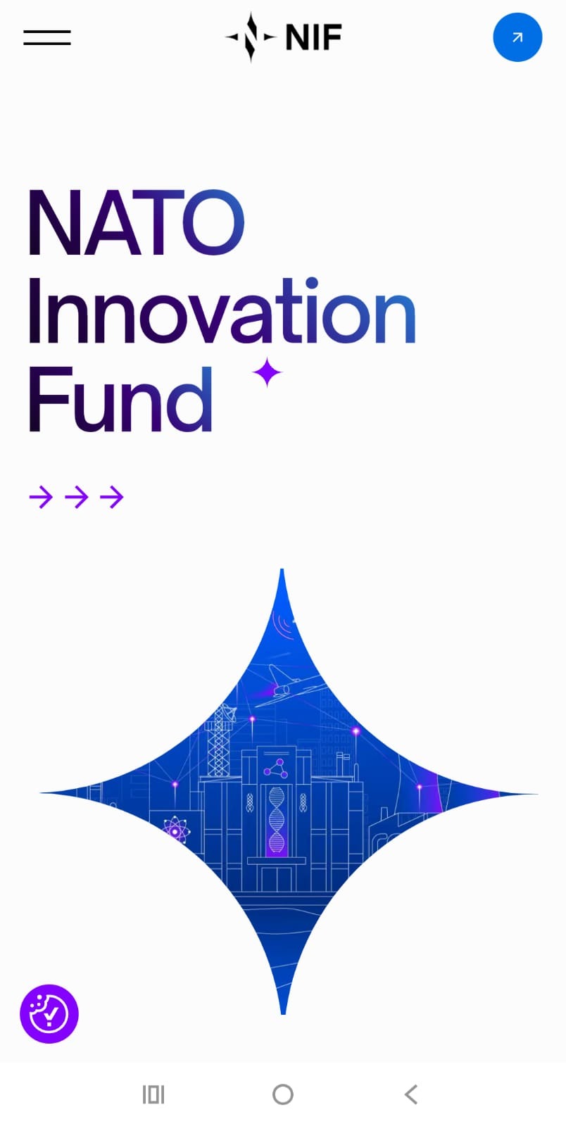
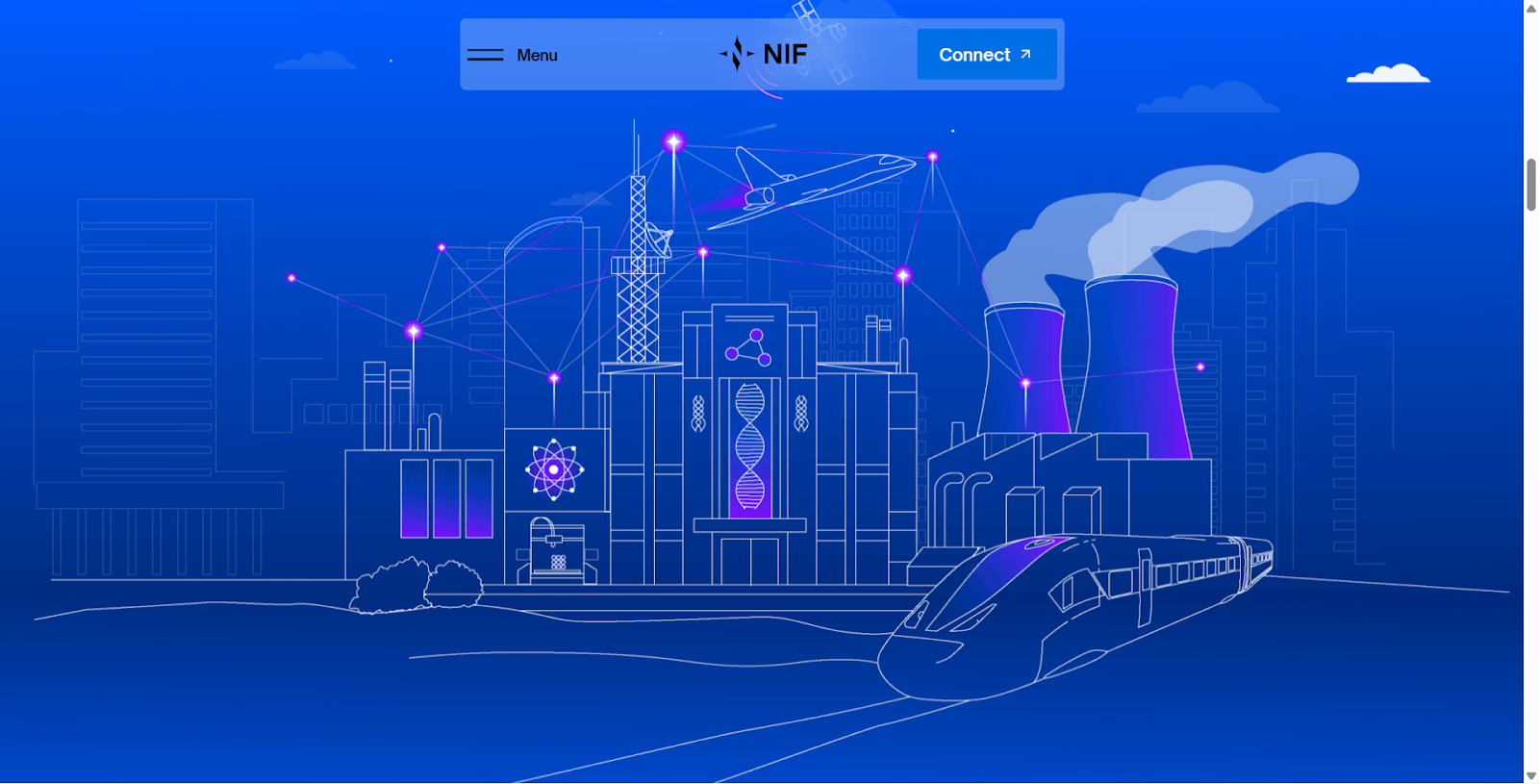
We’ve worked with top financial services brands in the UK – like Quonota, NATO Innovation Fund, and Fairvue Partners – and analysed hundreds of top-performing sites to bring you this guide.
Here are the 10 financial services website design features that are non-negotiable for brands looking to capture leads, build trust, and stay compliant.
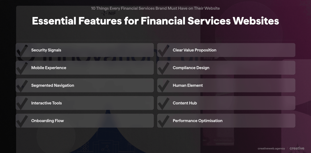
Financial Website Features That Help in Converting Financial Leads Online
Whether you’re creating a website for your financial services from scratch or looking to rebrand/redesign your current website, these 10 features should be a part of your website design.
1. “Bank-Grade” Security Visuals (That Users Actually Notice)
Why it matters:
It’s not enough to be secure; your users must feel secure. If a High Net Worth Individual (HNI) doesn’t see visible trust signals within 3 seconds, they won’t connect their portfolio. In fact, missing trust signals are a primary reason users abandon financial sites.
How to make your financial website bank-grade secure:
Go beyond the standard SSL padlock. Your financial services website design must show active, visible reassurance.
- Visible 2FA Prompts: Show that you take your customers’ data seriously before they even log in. Display logos of trusted payment gateways (Visa Secure, Mastercard, PayPal, etc.) to confirm that your payment process is secure and compliant with industry standards.
- Fraud Protection Badges: Display certifications (ISO, SOC2) prominently in the footer, not hidden on an “About” page. If most of your clients are from the US, a Better Business Bureau (BBB) Accredited Business seal can be a major trust builder.
- Clear “Last Login” Dashboards: For client portals, showing the last login time is a subtle but powerful psychological reassurance. This way, your customers can file a timely complaint if they see a suspicious login.
These badges act as psychological anchors and trust signals for financial brands. A report by FasterCapital confirms that “familiarity bias” plays a huge role in conversion – seeing a recognised security logo (like Norton or ISO) triggers a subconscious safety response, reducing the cognitive load for a user deciding whether to deposit funds.
📌Pro Tip: At CreativeWeb, we use Cloudflare DNS and managed firewalls to ensure that your bank website design isn’t just visually secure, but technically fortress-like.
2. Outcome-Focused Value Propositions
Why it matters:
Financial jargon kills conversions. Nobody wakes up wanting a “diversified multi-asset portfolio.” They want “retirement 5 years early” or “tax-efficient wealth transfer.”
One tip we can share from our experience in financial services marketing is that your website copy must be clear and closely aligned with the user’s real-life goals.
How to communicate value on your financial services website:
Your hero section needs to speak to the outcome, not the feature. Remember you’re speaking to a human, not a financial expert like yourself.
- ❌Bad: “We offer comprehensive wealth management services.”
- ✅Good: “Preserve your family’s legacy for the next generation.”
Tailored value propositions are the new standard. A retail bank must solve for convenience (“Open an account in 3 minutes”), whereas a wealth manager must solve for legacy (“Protecting wealth for generations”).
Using segment-specific landing pages allows you to speak directly to these distinct “psychographic” needs – whether it’s the anxiety of a first-time investor or the complexity of a family office.
📌Pro Tip: Use the “3-Second Rule.” If a user can’t tell if you are a retail bank or a private wealth manager in 3 seconds, your messaging has failed.
To learn how to guide your user’s eye to these key messages, we’d recommend checking out our guide on visual hierarchy in web design.
3. Seamless, “App-Like” Mobile Experience
Why it matters:
Your clients might sign the contract in person, but they check their portfolio performance on their phone.
If your site requires “pinching and zooming” on a phone screen to read a fund fact sheet, you look outdated (and inconvenient).
With over 45% of consumers using their mobile at least once per day for finance-related tasks, you must keep mobile banking user experience in mind for your financial services website design.
How to create a responsive financial web design:
- Thumb-Friendly Navigation: Critical buttons (Login, Contact) should be easily reachable with a thumb.
- Responsive Data Charts: Add investment graphs that stack beautifully on mobile screens rather than shrinking into unreadable lines.
Mobile data visualisation requires a “progressive disclosure” strategy. On a desktop, you might show a complex 5-year candlestick chart. On mobile, show a simple line graph first, with the option to “tap to expand” for granular details.
This keeps the interface clean for 90% of users who just want a quick summary, without alienating the 10% who want deep analysis.
📌CreativeWeb Insight: We design mobile-first. We wireframe the mobile experience before the desktop version to ensure your on-the-go clients get a premium experience. For more on this approach, read our UX Design in 2025 guide.
4. Regulatory Compliance as a Design Feature
Why it matters:
FCA, GDPR, and MiFID II compliance are mandatory, but most agencies treat them as ugly afterthoughts, cluttering the footer with unreadable legal text.
In 2025, the Financial Conduct Authority’s (FCA) “Consumer Duty” rules require that information is not only available but also understandable.
How to make your financial services website design FCA-compliant:
- Smart Risk Warnings: The risk disclosures on your site must be visible enough to be compliant, but designed in a simple manner so they don’t scare off potential leads.
- Role-Based Content Gating: A pop-up asking “Are you a Retail Investor or Professional Investor?” can help you segment users immediately, ensuring you show only compliant products to the right audience.
📌CreativeWeb Insight: Compliance is actually an opportunity for boosting your website’s user experience (UX). When you present complex fee structures or risk warnings in clear, bite-sized “accordions” or visual tooltips, you signal transparency, and users love that, especially in a niche that’s as complex as finance. This builds more trust than hiding terms in a 50-page PDF.
5. Segmented Navigation Structures
Why it matters:
Bank website designs and insurance websites often suffer from “product bloat.” You have mortgages, savings, business loans, and travel insurance all fighting for homepage space.
If a corporate treasurer has to wade through student loan offers to find FX services, they will bounce.
How to make the navigation of your bank website design seamless:
- Goal-Based Navigation: Instead of just “Products,” try “I want to…” (Buy a Home, Save for Retirement, Insure my Business). That makes the navigation much more intuitive.
- Audience Segmentation: Offer clear pathways for “Personal,” “Business,” and “Corporate” clients right at the top level. This will also help you control the funnel’s flow.
📌Pro Tip: Effective segmentation uses “cookie-based persistence.” Once a user selects “Institutional Investor,” your site should remember this preference for their next visit, automatically tailoring their homepage experience. This reduces friction and mimics the personalised service they expect from a relationship manager.
Learn how to audit your current structure in our guide: How to Run a UX Audit in 7 Steps.
Improve Your Financial Website Performance
Need a site that is secure, compliant, and easy for users to navigate? Our team can review your current website and highlight what needs to be improved.
Book a free website audit6. The “Human” Element (Real People, Not Stock Photos)
Why it matters:
Money is deeply emotional. People buy from people. Generic stock photos of “men in suits shaking hands” scream “fake” and fail to build the emotional connection required for high-stakes financial decisions.
How to make your financial services website design more human:
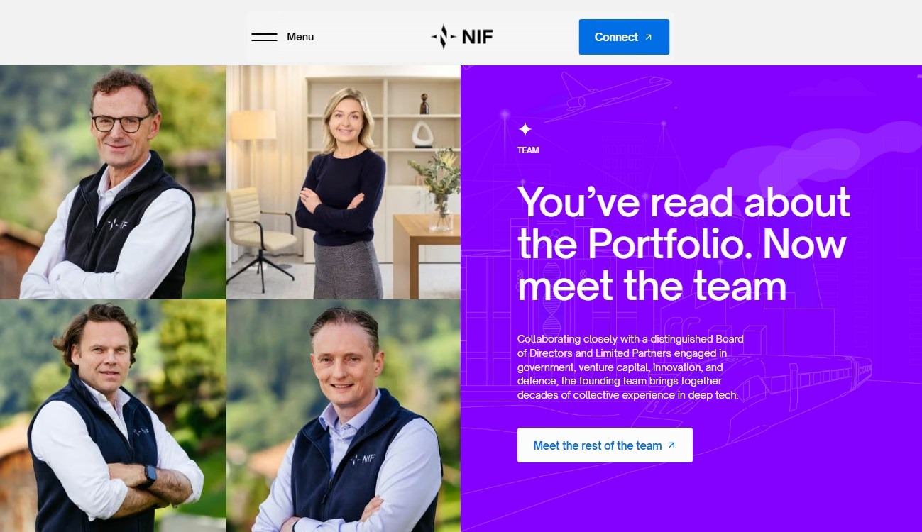
- Professional Team Headshots: Show high-quality, consistent photographs of your actual advisors. It is one of the wealth management website essentials that is often ignored.
- “Meet the Manager” Videos: Add short, 30-second clips where portfolio managers explain their philosophy. This builds a connection before the first meeting.
📌Pro Tip: Authenticity improves conversion. When users can see the face of the advisor they will be trusting with their wealth, the “risk barrier” lowers significantly. Ensure your photography is consistent in lighting and style to maintain a premium brand image.
7. Interactive Tools & Calculators
Why it matters:
Passive reading is boring. Active calculation builds ownership. When a user calculates their own mortgage savings or tax liability, they become psychologically invested in the solution.
Interactive content has been shown to generate 2–3x more engagement than static text, making it a critical tool for lead qualification. In fact, according to Marketing LTB, mortgage calculators retain users 3.5X longer, and interactive loan calculators see 76% customers return for use.
How to add interactive tools to your fintech website:
- Dynamic Calculators: Mortgage repayment estimators, pension shortfall planners, or tax-saving calculators can boost your website’s engagement multifold.
- Lead Magnet Integration: You can create a landing page for a lead magnet. Use a “Email me this result/PDF” CTA to capture warm leads directly from the website.
Don’t just build a generic calculator; build a “Decision Engine.” In 2025, one of the best practices for a fintech website is to use simple AI logic to suggest products based on the result.
If a user’s pension shortfall is high, the tool should automatically suggest a “High-Growth Portfolio” consultation rather than a generic contact form. This bridges the gap between self-service and advisory, offering immediate value while capturing intent data.
📌CreativeWeb Insight: We specialise in interactive & animated design, using tools like Lottie.js to make these interactive calculators visually stunning and engaging, not just functional spreadsheets.
See how animation can transform boring data into engaging experiences in our article: 8 Interactive Website Examples and Creative Animations.
8. A Searchable “Insights” Hub
Why it matters:
“Blog” sounds like a hobby. “Market Insights” sounds like expertise. In volatile markets like finance, your clients look to you for guidance. You can try some other words like “Publications” or “News”.
A well-structured content hub is not just for brand building; it is your primary engine for organic traffic and long-tail keyword ranking.
How to create the best SEO strategy for your financial services website:
- Advanced Filtering: Allow users to filter by topic (Tax, ESG, Crypto, Macro) and format (Video, Article, Podcast).
- Author Tagging: Link articles to specific advisors’ profiles to build their individual authority.
- Cluster Model: Instead of random articles, organise your hub into deep pillars – for example, a core “Estate Planning” pillar page linking to detailed articles on “IHT Thresholds,” “Trusts,” and “Gifting Rules.”
📌CreativeWeb Insight: One financial marketing website tip we always give our finance clients is to create “Content Clusters”. This signals topical authority to Google, helping you rank for high-value queries. Also, this strategy helps you rank in AI search engines as well.
9. Frictionless Onboarding Pathways
Why it matters:
The hardest part of fintech is the friction during sign-up. Asking for 20 fields upfront causes massive drop-offs. In 2025, “Progressive Profiling” is the standard – collecting data in stages to keep momentum high.
Fintech UX design best practices for seamless onboarding:
- Progressive Profiling: Ask for 3 pieces of info now (Name, Email, Goal), and the rest later. Once you have the user’s email in your list, you can occasionally ask them more questions to get more personal details.
- Calendar Integration: For wealth managers, replace the “Contact Us” form with a direct “Book a 15-min Discovery Call” calendar integration (Calendly/HubSpot). This reduces the friction for high-intent clients.
📌Pro Tip: Reduce cognitive load by using “Identity Verification” APIs (like Onfido or Sumsub) early in the flow. Instead of asking a user to type out their address, ask them to scan their driving licence. This feels like a security feature rather than a form-filling chore, actually increasing trust while reducing manual entry error.
10. Lightning-Fast Performance
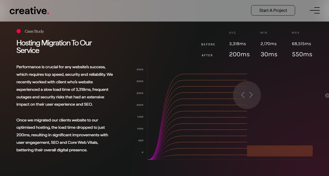
Why it matters:
In finance, speed = competence. A slow website suggests slow trade execution or slow customer service. Google’s Core Web Vitals are now a critical ranking factor, and a site loading in 1 second has a conversion rate 2.5x higher than one loading in 5 seconds.
How to make sure your financial website loads fast:
- Core Web Vitals Optimisation: Ensure your site passes Google’s strict speed tests (LCP, INP, CLS). Each millisecond counts here.
- Fast TTFB (Time to First Byte): The server response time must be instant. Use a reliable hosting provider with 99%+ uptime for faster response time.
Visual weight is often the silent killer of speed. Financial sites love high-resolution team photos and hero videos, but if unoptimised, these assets destroy load times on mobile networks.
Using next-gen formats like WebP and lazy-loading techniques ensures you keep the premium look without the performance penalty. For a deep dive on fixing this, read our Ultimate Guide to Website Image Optimisation.
📌CreativeWeb Insight: Our hosting delivers up to 5x faster speeds than traditional hosting, giving your financial brand the technical edge it needs to rank on Google and impress clients.
BONUS TIP: Make Your Website Fun and Unique
Why it matters:
The financial sector is notorious for its templatised, corporate-y website look. Scroll through 10 wealth management websites, and you will likely see the same 10 images of skyscrapers, compasses, and handshakes.
In a trust-based industry, blending in is dangerous. If your website looks identical to a competitor’s, your value proposition is forgotten the moment the tab is closed.
How can you make your financial website design unique and fun?
- Bold Colour Palettes: Ditch the safe “corporate blues” for vibrant, memorable accent colours that capture attention (like Monzo’s “hot coral” or Starling’s teal).
- Micro-Interactions: Subtle animations—like a button that “blooms” when hovered over, or a graph that draws itself, or your logo swoops in as an animation—add a layer of premium polish and delight.
- Conversational Tone: Swap “We facilitate cross-border transactions” for “Send money globally in seconds.” Wise, the payment transfer app, does this wonderfully on its website.
Being “fun” doesn’t mean being unprofessional; it means being human. Challenger banks like Revolut and Monzo didn’t win millions of users by looking like 100-year-old institutions. They won by using design to signal that they were different, accessible, and on the user’s side.
By breaking the “corporate template,” you create an emotional hook—something a generic template can never achieve.
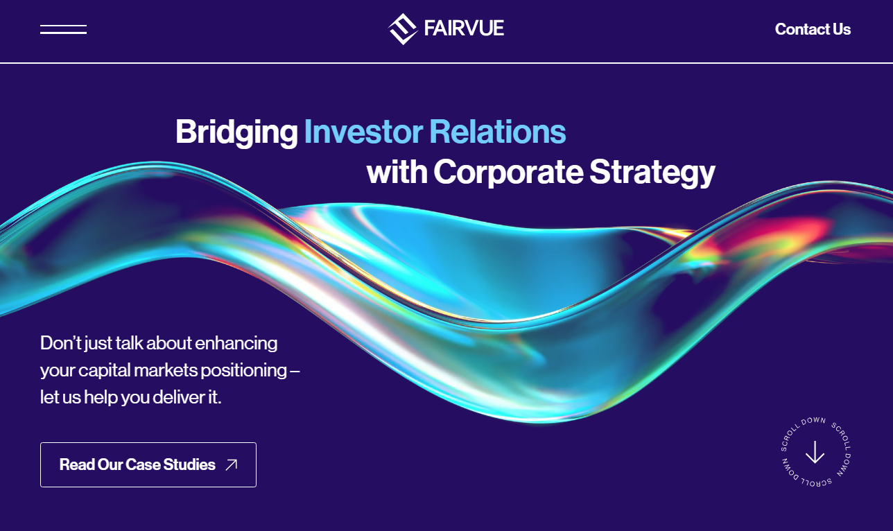
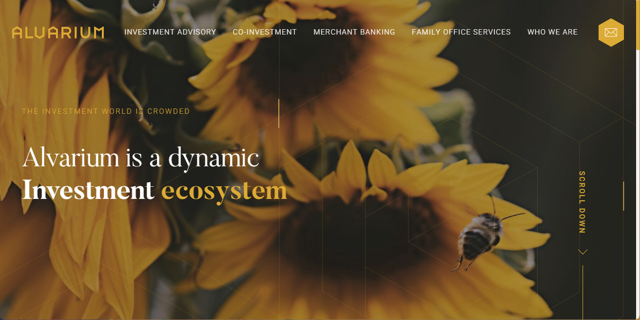
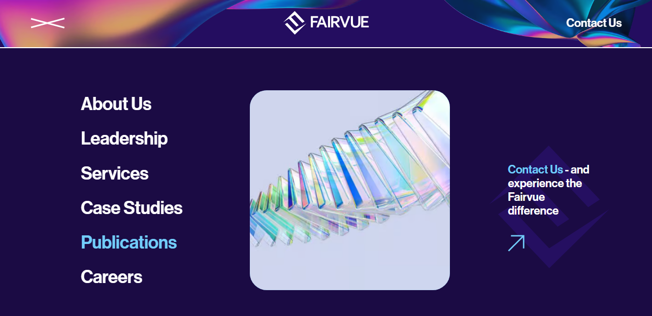
📌CreativeWeb Insight: We recently worked with Fairvue Partners, a management consultancy for investor relations and the capital markets.
We helped them “de-corporatise” their digital presence. By injecting personality into their design – through quirky custom illustrations and a unique typographic voice – we helped them move from being a “service provider” to a “financial brand.”
This uniqueness increases brand recall and user engagement, turning passive visitors into loyal advocates.
Conclusion
Designing a financial website is a specialised craft. It requires navigating the complex intersection of strict compliance, ironclad security, and high-end user experience.
You can try to patch this together with generic templates, or team up with us to build a digital asset that actually grows your Assets Under Management (AUM).
Ready to build a website that builds wealth?
At CreativeWeb, we are the award-winning London agency that understands the nuance of financial services.Contact CreativeWeb today for a free website audit and consultation. Let’s turn your digital presence into your best-performing asset.
FAQ
-
How do we ensure our new financial website design remains FCA-compliant?
-
Compliance shouldn’t be an afterthought; it must be baked into the design system. We recommend creating u0022compliance-approvedu0022 modules for risk warnings, terms, and financial promotions. This allows your marketing team to update content rapidly without breaking regulatory rules or design layouts.
Did this answer your question? YesThat’s great glad we could help! Start a ProjectNoNo problem, one of our experts can give you a more in-depth answer. Ask our Experts -
Can a custom website actually improve our Assets Under Management (AUM)?
-
Absolutely. A generic site tells a prospect you are u0022average.u0022 A high-performance, custom site signals prestige, stability, and competence – psychological triggers that are critical for high-net-worth individuals. By streamlining the user journey and offering interactive wealth-planning tools, you can move visitors from u0022passive browsingu0022 to u0022active enquiryu0022 more quickly.
Did this answer your question? YesThat’s great glad we could help! Start a ProjectNoNo problem, one of our experts can give you a more in-depth answer. Ask our Experts -
Is it safe to integrate client portals with a marketing website?
-
Yes, but separation is key. We recommend a u0022headlessu0022 architecture or a distinct sub-domain structure (e.g., portal.yourbank.com) for client logins. This ensures your marketing site remains fast and SEO-friendly, while your client data remains fortified behind bank-grade encryption and distinct server environments.
Did this answer your question? YesThat’s great glad we could help! Start a ProjectNoNo problem, one of our experts can give you a more in-depth answer. Ask our Experts -
How long does a financial website redesign typically take?
-
For a comprehensive financial website with compliance reviews and custom integrations, expect a 12–16 week timeline. This includes the discovery phase, security auditing, and rigorous testing. What we do for our financial website design clients is launch in phases – getting the core marketing pages live first while complex calculators or portals are developed in parallel.
Did this answer your question? YesThat’s great glad we could help! Start a ProjectNoNo problem, one of our experts can give you a more in-depth answer. Ask our Experts