What Makes a Good Website in 2026: Design Principles That Actually Matter

Someone just typed your company name into Google. They clicked through to your website. And in the time it took you to read those two sentences, they’ve already formed an opinion about whether your business is worth their time.
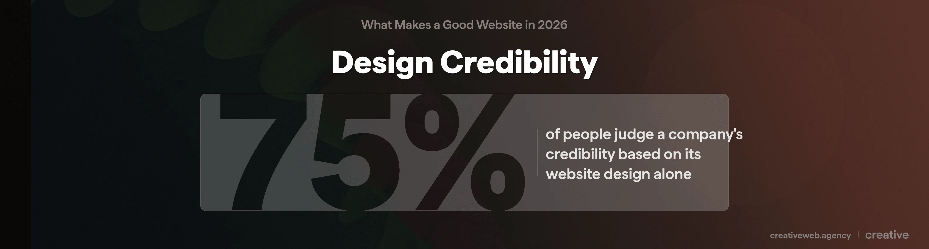
That’s not an exaggeration. Research from Stanford’s Web Credibility Project found that 75% of people judge a company’s credibility based on its website design alone. Not the quality of your services. Not your years of experience. The design.
There are hundreds of articles about web design “tips” and “best practices” online. Most of them list the same generic advice you could get from any template provider.
This one’s different: it’s written from the perspective of an agency that’s built and audited hundreds of UK business websites, and it includes a scored self-assessment checklist you can run on your own site in about 15 minutes. If you want to know what actually makes a good website in 2026 (and whether yours measures up), keep reading.
Why Good Website Design Matters More Than You Think
“Our website looks fine” is something we hear quite often. Usually from businesses whose sites look exactly like they did in 2019.
The problem is that “fine” isn’t a standard anymore. Your competitors have moved on. Your customers’ expectations have shifted.
And Google now actively ranks websites based on how well they actually work for users, not just whether they’ve got the right keywords scattered about.
First Impressions and the 3-Second Rule
There are actually two “3-second rules” in website design, and almost every article online conflates them.
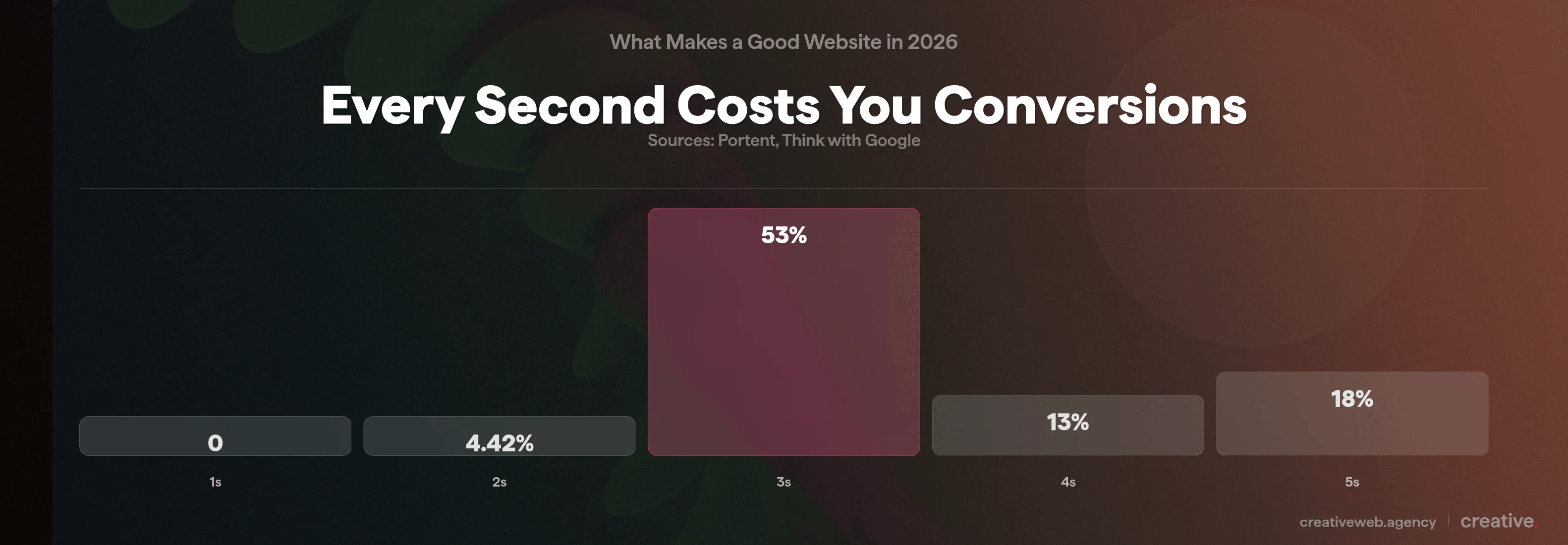
The first is technical: your main content should load within 2.5 seconds (that’s Google’s Largest Contentful Paint threshold). If your site takes longer than 3 seconds to load on mobile, 53% of visitors will leave before they see anything at all (Think with Google).
The second is cognitive: can a visitor understand what your business does and what they should do next within about 3 seconds of the page appearing? That’s the comprehension test, and it has nothing to do with loading speed.
Both matter. A fast site that confuses people still fails. A clear site that loads slowly never gets the chance to impress anyone.
What Poor Design Actually Costs
The numbers here are quite hard to argue with. According to Econsultancy, 88% of online visitors won’t return to a site after a bad experience. Forrester Research found that $1 invested in UX returns approximately $100 in business value.
And Portent’s research shows a 1-second delay in page load time can reduce conversions by 4.42%.
We had a client last year (a building services company in London) whose website looked perfectly fine on desktop. On mobile, the contact form was buried three scrolls down, the text was tiny, and the phone number wasn’t clickable.
They were getting about 40 enquiries a month. After a redesign focussed purely on mobile usability and CTA placement, that number jumped to 110. Same traffic, same services, different design.
That’s what good website design actually does: it stops your site from getting in its own way.
Mobile-First Design (Not Just Mobile-Friendly)
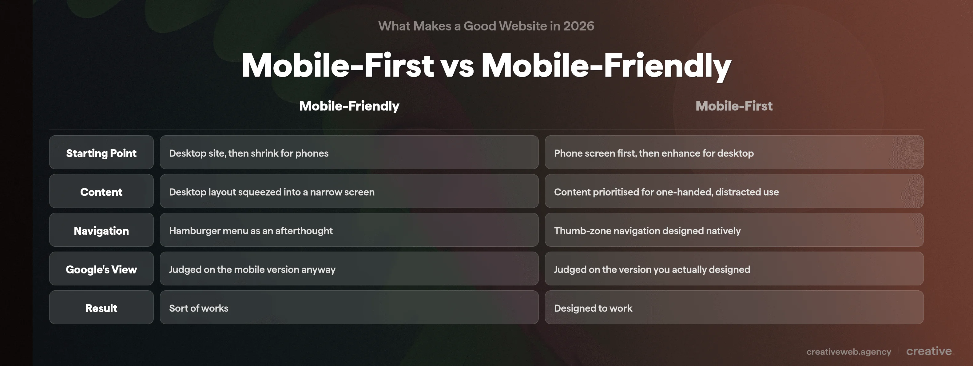
There’s a difference between a website that works on mobile and a website designed for mobile. It’s a bigger difference than most people realise.
What Mobile-First Actually Means for Design Decisions
Mobile-friendly usually means someone built a desktop website and then made sure it didn’t completely fall apart on a phone. The layout shrinks, the menus collapse into a hamburger icon, and everything technically works (sort of).
Mobile-first is the opposite approach: you design for the phone screen first, then add complexity for larger screens. Content hierarchy, navigation patterns, and touch interactions are all built around how someone actually uses a phone (one hand, scrolling, usually distracted).
Why does this matter? Because over 60% of web traffic in the UK now comes from mobile devices (Ofcom, 2025).
Google switched to mobile-first indexing years ago, meaning they literally rank your site based on the mobile version. If you have a desktop-first site that sort of works on mobile, Google is judging you on the “sort of works” version.
Touch Targets, Speed and Local Search
Right, so what does this look like in practice?
Tap targets need to be at least 48px by 48px (Google’s recommendation). If your visitors are having to pinch and zoom to tap a tiny link, that’s a design failure. Navigation should sit within thumb reach: the bottom of the screen is where most people can comfortably tap (especially on the larger phones that are everywhere now).
For local businesses, mobile design is basically non-negotiable: 76% of people who search for something nearby on their phone visit a business within 24 hours (Think with Google).
Top tip: open your own website on your phone right now. Try to complete the most important action (book a call, fill in a form, find your phone number) using only your thumb. If it’s awkward, your mobile visitors are having the same experience. Every single day.
Speed, Performance and Core Web Vitals
Google measures your site’s performance using three specific metrics called Core Web Vitals. They sound technical, but they’re quite straightforward once we strip the jargon away.
LCP, INP and CLS: What They Actually Mean
| Metric | What It Measures | Good Score | In Plain English |
|---|---|---|---|
| LCP (Largest Contentful Paint) | How quickly the biggest visible content loads | Under 2.5 seconds | How fast your page “appears” to the visitor |
| INP (Interaction to Next Paint) | How quickly the site responds when someone clicks | Under 200 milliseconds | How snappy buttons and links feel |
| CLS (Cumulative Layout Shift) | Whether content jumps around as the page loads | Under 0.1 | Whether the page stays still or shifts about annoyingly |
These aren’t vanity metrics. Core Web Vitals are a confirmed Google ranking signal (Google Search Central). Sites that pass all three thresholds get a measurable advantage in search results.
So does that mean a fast website will automatically outrank everyone? No. Speed is one ranking factor among many. But a slow website will definitely hold you back, especially on mobile where connections are less reliable.
Practical Speed Improvements That Make a Measurable Difference
You don’t need to rebuild your entire website to improve speed. For most WordPress sites we work on, these changes make the biggest difference:
- Convert images to WebP or AVIF format. A typical JPEG hero image might be 800KB. The same image in WebP is usually 200-300KB (basically the same quality, much smaller file).
- Enable lazy loading so images below the fold don’t load until someone scrolls to them.
- Use a caching plugin (WP Rocket, LiteSpeed Cache, or similar) to serve pre-built pages instead of generating them fresh on every visit.
- Minimise render-blocking resources by deferring non-critical JavaScript and CSS.
TLDR: run your site through Google PageSpeed Insights (it’s free). Look at your mobile score. If it’s below 70, there’s usually easy improvement available. Below 50, speed is almost certainly costing you visitors and you should treat it as urgent.
User Experience, Navigation and Visual Hierarchy
A good-looking website that’s hard to use is still a bad website. This is probably the most common disconnect we see: businesses invest in flashy visuals and forget that people actually need to find things.
Navigation That Works
Keep your main menu to 5-7 items. Not 12. Not 15. If you have lots of pages, use dropdown menus or a well-organised footer for secondary content.
Labels should be obvious. “Services” not “What We Do.” “Contact” not “Let’s Chat.”
Steve Krug put it well in Don’t Make Me Think: if a visitor has to think about where to click, you’ve already lost them. Hick’s Law backs this up: the more choices you present, the longer people take to decide (and the more likely they are to just leave).
So is the 3-click rule still a thing? Not really. The old idea that users should reach any page within 3 clicks has been largely debunked by Nielsen Norman Group.
What actually matters is cognitive effort: does each click feel like obvious progress towards what they’re looking for? A 5-click journey with clear signposting beats a 2-click journey where the user had to guess.
Visual Hierarchy, White Space and Layout
Your eye should travel naturally from the most important element (usually the headline) through the supporting content to a call to action. That’s visual hierarchy, and it’s achieved through size, colour, contrast, and spacing.
On content-heavy pages, readers tend to scan in an F-pattern (across the top, then down the left side). On landing pages, it’s more of a Z-pattern (top left to top right, then diagonally down to the CTA).
White space isn’t wasted space. It’s what makes content readable and gives the eye somewhere to rest. A page crammed with text, images, and buttons everywhere looks like a market stall (and converts about as poorly as one, too).
In our experience, the biggest visual design problem for UK SME websites is simply looking dated. If your site still has a full-width slider, tiny body text, and stock photos of people shaking hands in a boardroom, visitors notice. Modern web design in 2026 favours clean layouts, generous spacing, bold typography, and authentic imagery.
Content Readability and Typography
This is a design decision, not just a copywriting issue:
- Body text should be at least 16px (1rem). Anything smaller forces people to squint on mobile.
- Line height of 1.5 to 1.6 gives text room to breathe.
- Maximum 75 characters per line. Longer lines are harder to read because your eye loses its place tracking back to the start of the next line.
- Heading hierarchy matters: one H1 per page, then H2s, then H3s. Never skip levels. This helps readability AND search engines.
- Limit yourself to 2-3 fonts. More than that starts to look chaotic.
And please: use real photographs of your actual team and workspace instead of generic stock imagery. We can all spot the “diverse group of coworkers laughing at a laptop” photo at this point. Nobody believes it’s your office (and if it is, I have questions about your recruitment process).
Not Sure if Your Website Design Measures Up?
Our website audit highlights exactly what’s working, what’s not, and where to focus your next investment.
Get a Free Website AuditTrust Signals, Branding and Conversion Design
A visitor can think your website looks great and still not enquire. We see this regularly: something feels off, or they simply can’t figure out what to do next.
What Actually Builds Trust Online
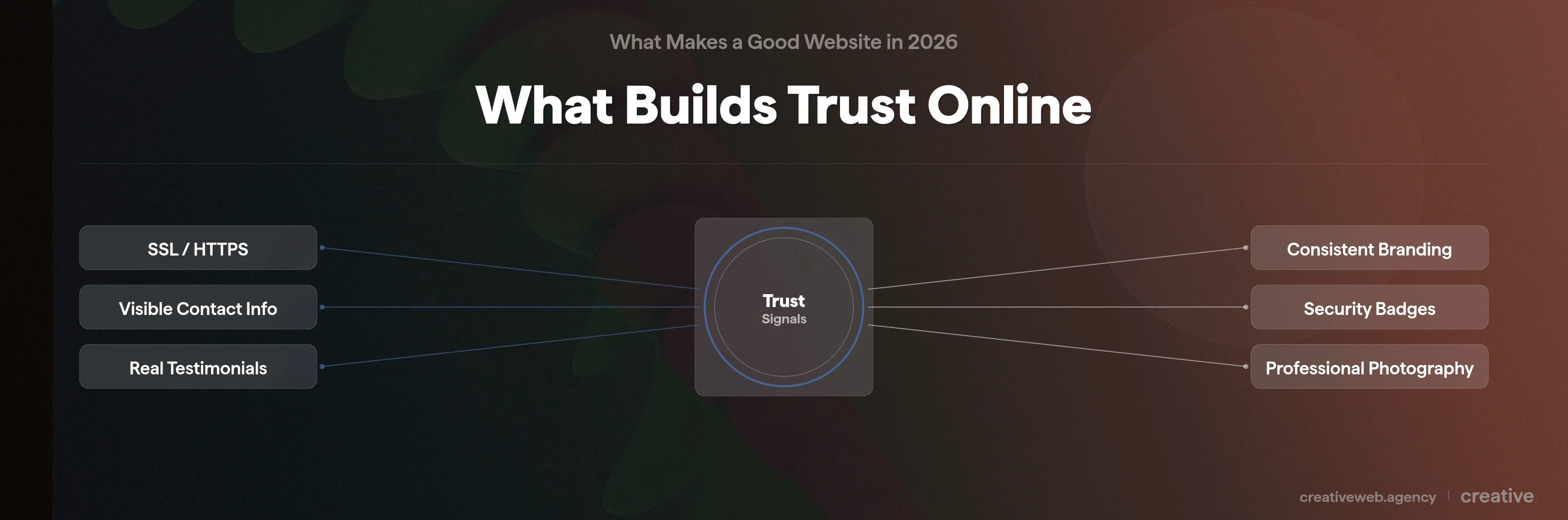
These are the things that move visitors from “this looks professional” to “I’d actually contact these people”:
Start with SSL/HTTPS: if your URL shows “Not Secure” in the browser bar, fix that today. It’s a ranking signal AND a trust signal, and it’s usually free through your hosting provider.
Then make sure your contact information is visible on every page, not buried in the footer in 10px font. A phone number and email in the header or a sticky contact bar makes a real difference.
Testimonials carry weight when they include real names and photos. Generic quotes from “John, London” don’t convince anyone. Testimonials linked to real businesses or LinkedIn profiles do.
And keep your branding consistent across every page: same colours, fonts, and tone throughout. Inconsistency looks amateurish even if the individual pages are fine on their own.
NB: for ecommerce sites, trust signals become even more critical. Payment security badges, a clear returns policy, and visible customer service options can all reduce cart abandonment. The Baymard Institute found that 19% of shoppers abandon carts specifically because they don’t trust the site with their payment details.
CTAs That Convert (Not Just “Submit”)
Your call to action should tell visitors exactly what happens when they click it. “Get Your Free Quote” is better than “Submit.” “Book a 15-Minute Call” is better than “Contact Us.”
Placement matters too. Your primary CTA should appear above the fold (visible without scrolling), after key value sections, and at natural decision points throughout the page.
Here’s one that surprises people: every form field you add costs you roughly 10% of conversions (Baymard Institute). If you’re asking for name, email, phone, company name, budget, timeline, and a message, you’re losing people before they finish.
Ask yourself what you actually need to start a conversation. Usually it’s a name, an email, and a brief message. That’s it.
Security, Privacy and GDPR
HTTPS is table stakes (we covered this above). Beyond that:
Cookie consent needs to be done properly: a real, genuine choice, not just a dismissible banner that auto-accepts everything. Your privacy policy should actually exist and be written in plain English. And if you’re selling online, PCI DSS compliance isn’t optional.
But if you’re a service-based business, don’t overcomplicate this. Get SSL sorted, add a privacy policy, handle cookies properly, and you’re covered for the basics.
Accessibility: Better Design for Everyone
Here’s something we’ve noticed most website design articles get wrong: they frame accessibility purely as a legal checkbox. It isn’t. Accessible design is simply better design that works for more people.
What WCAG 2.2 Means in Practice
WCAG (Web Content Accessibility Guidelines) version 2.2 at AA level is the current standard. It’s built on four principles, sometimes called POUR:
| Principle | What It Means | Practical Example |
|---|---|---|
| Perceivable | Users can see or hear all content | Alt text on images, video captions, colour contrast of at least 4.5:1 |
| Operable | Users can navigate and interact | Keyboard navigation works, no time limits on forms, clear focus indicators |
| Understandable | Content and interface are clear | Plain language, consistent navigation, form labels that make sense |
| Robust | Works across browsers and assistive tech | Semantic HTML, proper heading structure, ARIA labels where needed |
Quick wins we recommend to every client: add meaningful alt text to every image (not “image1.jpg”), ensure colour contrast passes (the free WebAIM Contrast Checker takes seconds), make sure your site can be navigated entirely by keyboard (just press Tab and see what happens), and use proper heading hierarchy.
Your Legal Obligations in 2026
The UK Equality Act 2010 already requires websites to be accessible to disabled users (it’s broader than the US ADA in some respects). The European Accessibility Act, which came into effect in June 2025, adds further requirements for UK businesses that sell to EU customers, even post-Brexit.
But here’s why accessibility is actually a competitive advantage rather than a burden: over 1 billion people worldwide have some form of disability (WHO). Add the ageing population, people using devices in bright sunlight, someone with a broken arm trying to navigate one-handed, and the audience for accessible design is basically everyone.
If you want to make your site work for the widest possible audience (and you should, because that’s literally more potential customers), accessibility is where to start.
SEO-Friendly Design and AI-Ready Content
Good design and good SEO aren’t separate disciplines. In our experience, they’re the same conversation. The design decisions you make directly affect whether Google (and increasingly, AI systems) can understand, rank, and cite your content.
Design Decisions That Affect Search Rankings
Use semantic HTML: proper heading tags (H1, H2, H3) rather than just bold text that looks like a heading. Search engines use heading structure to understand your content hierarchy.
Structured data (schema markup) is just as important: adding FAQ, Article, or LocalBusiness schema helps Google display your content in rich results. It’s basically metadata that tells search engines what your content IS, not just what it says.
Internal linking helps Google discover content and understand how your site is organised. We’ve written about this in more detail on our SEO services page.
Your URL structure matters too: /website-design/good-website-design/ tells both users and Google what a page is about, while /?p=709 tells nobody anything. And don’t forget image alt text: it’s an accessibility requirement AND an SEO signal.
Designing for AI and Generative Search
This is the 2026-specific angle that most web design articles miss entirely.
Google’s AI Overviews now appear for a huge number of search queries, and they cite specific websites as sources. If you look at who gets cited for queries like “what makes a good website,” it’s often small UK agencies with clear, well-structured content. That’s an opportunity. Well-structured content with clear definitions, specific statistics, and named sources is what gets cited in AI search results.
So what makes content citable by AI? Clear, direct definitions at the start of each section. Numbered lists for “rules” and “steps” type queries. Specific statistics with named sources. Self-contained sections that make sense on their own (basically, each section should work even if someone only reads that one part).
This is part of an emerging discipline called Generative Engine Optimisation (GEO). It’s not about gaming AI: it’s about structuring your content so that when an AI system needs to answer a question your page covers, yours is the obvious source to cite. Structured data (schema markup) acts as the bridge between your design and AI citation.
The Most Common Website Design Mistakes (and What to Do Instead)
We audit dozens of UK business websites every year. These are the mistakes that come up again and again:
- No mobile optimisation. We still see sites in 2026 that are essentially desktop-only. With over 60% of traffic from mobile, this is the single fastest way to lose potential customers.
- Slow loading times. If your PageSpeed Insights mobile score is below 50, you have a problem. Usually it’s uncompressed images, too many plugins, or budget hosting. All fixable.
- Cluttered navigation with too many items. I’d love to say we’ve never built a site with a 15-item menu. I absolutely cannot say that. But we’ve learned: when everything is a priority, nothing is. Simplify to 5-7 core items.
- No clear call to action. Every page should make it obvious what the visitor should do next. If you’re not asking, they’re not doing it.
- Outdated visual design. Full-width sliders, tiny text, stock-photo headers, and a general “last updated 2018” feel. Visitors can register this instantly, even if they can’t articulate why your site feels old.
- Contact information hidden away. Your phone number and email should be visible on every page. Not just on the contact page. Not just in the footer.
- Ignoring accessibility entirely. Beyond the legal requirements, basic accessibility fixes (contrast, alt text, keyboard navigation) improve the experience for every single visitor.
- No analytics tracking. If you’re not measuring what happens on your site, you’re guessing. Google Analytics 4 and Microsoft Clarity (which gives you heatmaps and session recordings) are both free. There’s no excuse for flying blind.
How to Tell if Your Website Design Measures Up
Ok, so here’s the part you can actually do something with right now. We’ve put together a 12-item scorecard you can run on your own site in about 15 minutes. All you need is a phone, a browser, and a couple of free tools.
Score 1 point for each item you pass.
Mobile (2 points)
1. Does your site pass Google’s Mobile-Friendly Test? Go to search.google.com/test/mobile-friendly and enter your URL. Pass = your site is responsive. Fail = Google is showing a degraded version to over 60% of your visitors. Fix: talk to your developer about responsive design (this is one of the most urgent fixes you can make).
2. Can you easily tap all buttons and links with your thumb? Open your site on your phone and try tapping every menu item, button, and link using just your thumb. If anything is too small or too close together, your tap targets are below the 48px minimum. Fix: increase button sizes and add spacing between clickable elements.
Speed (2 points)
3. Does your site score 70+ on PageSpeed Insights (mobile)? Go to pagespeed.web.dev, enter your URL, and check the mobile score. Below 50 = urgent. 50-69 = needs work. 70+ = pass. Fix: compress images (WebP format), enable caching, review your plugins.
4. Does your main content load within 2.5 seconds? On PageSpeed Insights, look for your LCP score. Green (under 2.5s) = pass. Orange or red = your visitors are waiting too long. Fix: optimise your largest above-the-fold image and consider better hosting.
Design and UX (3 points)
5. Can a first-time visitor understand what you do within 3 seconds? Show your homepage to someone who hasn’t seen it before. Ask them what the business does. If they can’t answer immediately, your messaging or layout needs work. This is the cognitive 3-second test.
6. Is there a clear visual hierarchy? Does the eye naturally flow from headline to key content to call to action? Or does everything compete for attention equally? Fix: use size, colour, and spacing to create a clear reading path. Bigger = more important.
7. Is your body text at least 16px with good line spacing? Right-click your body text in Chrome, click “Inspect,” and check the font-size value. Below 16px (or 1rem) is too small for comfortable reading on any device. Fix: increase your base font size in your theme settings.
Trust and Conversion (2 points)
8. Is your contact information visible on every page? Not just the footer. A phone number or email in the header, or a sticky contact bar that follows the user. Fix: add contact details to your site header as part of the design.
9. Does every key page have a clear, specific CTA? Check your homepage, service pages, and key landing pages. Each should have an obvious next step: “Get a Quote,” “Book a Call,” or something equally specific. “Submit” doesn’t count. Fix: add CTAs above the fold and after value sections.
Accessibility (2 points)
10. Does your site pass a basic WAVE scan? Go to wave.webaim.org and enter your URL. Look for red error icons (yellow warnings are less critical). Zero errors = pass. Any errors = fail. Fix: start with contrast issues and missing alt text.
11. Can you navigate your site using only a keyboard? Open your site in Chrome and press Tab repeatedly. Can you reach all menus, links, and forms? Can you see where you are on the page (focus indicators)? Fix: ensure all interactive elements are keyboard-accessible with visible focus styles.
SEO (1 point)
12. Does your site have a logical heading hierarchy? Right-click, “View Page Source,” and search for <h1, <h2, <h3. There should be exactly one H1 per page, followed by H2s and H3s in logical order. No skipping from H1 straight to H3. Fix: restructure your headings in your CMS editor.
Your Score
- 9-12: Your site is in strong shape for 2026 standards. Keep monitoring and refining.
- 5-8: There’s clear room for improvement, but now you know exactly where to focus. Start with any Mobile or Speed fails: they affect everything else.
- 0-4: Your website is likely costing you business. A professional design audit would help you prioritise what to tackle first. Get in touch if you want to talk it through.
Frequently Asked Questions
-
What are the 5 golden rules of web design?
-
The five most important rules are: design mobile-first, make it fast (under 2.5 seconds LCP), keep navigation simple and intuitive, build in clear calls to action, and make it accessible to everyone. These aren’t arbitrary rules: each one is backed by measurable impact on user behaviour and search rankings. Get these five right and you’re already ahead of most competitors.
Did this answer your question? YesThat’s great glad we could help! Start a ProjectNoNo problem, one of our experts can give you a more in-depth answer. Ask our Experts -
What are the 7 C’s of a website?
-
The 7 C’s framework covers Context (visual design and layout), Content (text, images, and video), Community (social proof and user interaction), Customisation (personalised experience), Communication (dialogue with users), Connection (links to other resources), and Commerce (transactional capability). It’s a useful academic framework, though in practice most UK small business websites should focus on getting content quality, clear communication, and trust-building right first.
Did this answer your question? YesThat’s great glad we could help! Start a ProjectNoNo problem, one of our experts can give you a more in-depth answer. Ask our Experts -
What is the 3 second rule in website design?
-
There are actually two 3-second rules that often get confused. The first is technical: your page should load within 3 seconds (ideally under 2.5 seconds for Google’s LCP metric), because 53% of mobile visitors leave if it takes longer (Think with Google). The second is cognitive: a first-time visitor should understand what your business does and what to do next within about 3 seconds of the page appearing. Both are important, and they measure completely different things.
Did this answer your question? YesThat’s great glad we could help! Start a ProjectNoNo problem, one of our experts can give you a more in-depth answer. Ask our Experts -
Is WordPress good for website design?
-
Yes. WordPress powers about 43% of all websites globally (W3Techs, 2025) and is perfectly capable of producing well-designed, fast, accessible websites. The quality comes from the theme, the development approach, and the content: not the platform itself. Where WordPress sites often struggle is with too many plugins, cheap themes, and budget hosting. All of which are fixable without switching platforms.
Did this answer your question? YesThat’s great glad we could help! Start a ProjectNoNo problem, one of our experts can give you a more in-depth answer. Ask our Experts -
What are the 5 elements to a good website design?
-
The five essential elements are: a responsive (mobile-first) layout, fast loading performance, clear visual hierarchy with readable typography, trust signals (testimonials, SSL, visible contact info), and accessibility. These are the foundations. If any one of them is missing, the website has a structural problem that no amount of visual polish will fix.
Did this answer your question? YesThat’s great glad we could help! Start a ProjectNoNo problem, one of our experts can give you a more in-depth answer. Ask our Experts -
Good website design vs bad: what’s the difference?
-
Good design serves the user first. It loads quickly, communicates clearly, builds trust, and makes the next step obvious. Bad design serves the business’s ego: flashy animations nobody asked for, cluttered layouts, hidden contact information, and content that talks about the company instead of solving the visitor’s problem. The quickest test: can a stranger land on your homepage and know what you do, who you do it for, and what to do next within a few seconds? If not, that’s a design problem.
Did this answer your question? YesThat’s great glad we could help! Start a ProjectNoNo problem, one of our experts can give you a more in-depth answer. Ask our Experts -
How often should a website be redesigned?
-
There’s no fixed schedule, but a full redesign every 3-5 years is typical for most businesses. More importantly, your site should be continuously maintained: content updates, performance monitoring, security patches, and incremental design improvements. A site that’s well-maintained and regularly updated might never need a dramatic full redesign.
Did this answer your question? YesThat’s great glad we could help! Start a ProjectNoNo problem, one of our experts can give you a more in-depth answer. Ask our Experts -
Should websites follow design trends or focus on functionality?
-
Functionality first, always. Trends are cosmetic (bold typography, glassmorphism, dark mode) and they come and go. The fundamentals we’ve covered here (speed, usability, accessibility, clear CTAs, trust signals) are permanent. That said, a website that looks visually current does build credibility: visitors can tell when a design feels dated, even if they can’t explain why. The sweet spot is solid functionality with a clean, modern visual treatment.
Did this answer your question? YesThat’s great glad we could help! Start a ProjectNoNo problem, one of our experts can give you a more in-depth answer. Ask our Experts
Good website design in 2026 isn’t about following trends or making something that looks impressive on a design portfolio. It’s about building a site that works for your visitors and your business.
The principles haven’t changed as much as people think. Speed, clarity, trust, accessibility, and putting the user first. What has changed is the bar. Mobile-first is non-negotiable. Performance is a ranking factor. Accessibility is a legal requirement. And AI systems are starting to decide which websites get cited in search results.
Run the scorecard above. See where your site stands. And if the results flagged something you’re not sure how to fix, that’s exactly the kind of thing we help with. Head over to our website audit page and we’ll take a proper look.