How SaaS and B2B Tech Companies Build Websites That Convert in 2025
SaaS and B2B tech websites now do most of the work in the buying journey. HubSpot’s B2B Buyer Survey reveals that 75% of buyers gather information independently. This transforms the website into a place where decisions are made, rather than just a touchpoint.
The tricky part is ensuring your tech website design caters to your visitors’ different needs. Some want enough detail for both business and technical teams to see how the platform fits into their stack. Others need to see the product in action. That could mean trying a demo, exploring a trial, or jumping straight into documentation and integration notes. These days, buyers also look for AI-driven insights when comparing options. A basic corporate site layout usually falls short for decisions like these.
This guide breaks down what a high-converting tech website needs in 2025. You’ll see what matters to buyers today and where many B2B SaaS sites fall short.
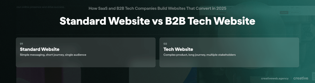
The Core Difference Between Tech Websites and Standard Websites
A standard website often tells a straightforward story. A tech website must help people understand a complex product that they may not be familiar with. Below are their core differences.
B2B buying cycles are longer
Research from Dentsu found that the average B2B buying cycle now runs for about 379 days. That’s more than a year from first research to closing a deal.
Not one person makes the call in B2B. Managers, technical reviewers, and procurement teams often review things simultaneously. They visit different parts of the site and ask different questions. If the site doesn’t address each group’s needs, the process slows down or stops.
Complex product understanding
Prospects judge the product by how clearly the website explains it. When documentation is buried or unclear, they’ll think the tool will be difficult to adopt. Thin or vague integration pages send the same message. Vague use cases create friction. If teams can’t see the product’s value clearly enough, they can’t defend the purchase inside their company.
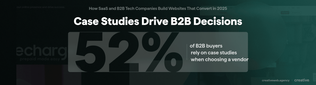
Need for credibility and proof
Most B2B SaaS buyers research with multiple tabs open, checking your claims against competitors’. That’s why case studies and real client results matter. They show how the product holds up in an environment similar to the buyer’s. A Demand Gen Report survey found that 52% of buyers consider case studies the most useful content when evaluating a vendor.
Performance expectations
Tech visitors often take site performance as a hint about the product. When pages load slowly, buyers start wondering what the engineering team is like. Even small issues, like buttons that move or layouts that break on certain screens, make buyers question stability and attention to detail.
Security and compliance signals
Security signals on a tech site demonstrate the company’s commitment to privacy. Tight wording in confidentiality notes translates to a thorough team. Clear access controls often show that the team works in an organised way. Even small choices in login flows stand out to technical reviewers. These signals help buyers picture what it might be like to send real data through the platform.
What a High-Converting Tech Website Must Include
A high-converting tech website guides different kinds of buyers. It needs to provide enough detail for search and discovery purposes while avoiding pages that feel cluttered or overwhelming. Here are the parts that matter most:
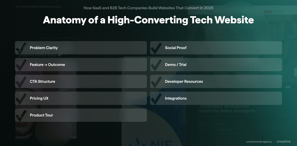
1. Clear problem statement above the fold
Most visitors try to see if your product solves their problem. When the header feels vague or too marketing-heavy, doubt creeps in. A clear problem statement builds trust because buyers can see what the product fixes. It also helps with SEO because the page uses language that aligns with real search terms. Many tech sites hide their problem statement behind brand messaging. A website audit can quickly resolve this.
2. Social proof mapped to audiences
Social proof works best when it speaks directly to the person reading the page. Technical reviewers look for signs that the product is reliable and works with their existing tools. Meanwhile, business teams look for outcomes they can share with their leaders. A row of client logos might look impressive, but buyers want case studies or customer stories that mirror their own situation.
3. Feature to outcome translation
Visitors search for outcomes rather than specific features. Most buyers type the problem they want solved and skip the technical terms. When your page uses the same language they use during research, it helps move them to the next step in their assessment. A good website design shows how each feature leads to an outcome in simple steps. This helps buyers picture how the product fits into their workflow.
4. Demo or trial options structured for UX
Buyers want different ways to try the product. Some want to see it in motion, while others prefer walkthrough scenarios that reflect real use cases. These options need to be easy to find and compare. A smooth demo or trial helps buyers experience value quickly and understand how the tool would work in their own setup.
5. Strong CTA hierarchy
A tech site often needs several calls to action, even though visitors won’t necessarily click every button. Some jump straight to a free consultation. Others take a slower path, such as saving a page or sending the details to a teammate. A clear CTA hierarchy guides each buyer forward without feeling pushy. It keeps the main CTA clear and offers secondary options for those still undecided.
6. Developer resources or support links when relevant
Developer content doesn’t need to be front and centre, but it should be easy to find. Many technical reviewers start with the documentation to understand how the product is built. Small details can make a strong impression, like a clear API page or an integration guide showing how the tool connects to existing systems.
7. Pricing page UX
If the pricing is public, visitors expect clear tiers and simple explanations. For private pricing, visitors try to understand what affects the cost so they can justify the investment to their own team. In both cases, clarity matters more than persuasion. A confusing pricing page can slow the buying cycle.
8. Partner ecosystem pages
These show buyers how the product integrates with the tools they already use. Buyers read these pages to understand the integration risk. They look for signs that the ecosystem is growing and that partners are active. They also want to know the platform won’t trap them with limited options later.
9. Product tour or interactive modules
Interactive modules help visitors explore complex features without reading long sections of text. They help non-technical buyers get a clearer idea of what they’re buying. A good product tour gives people a quick, realistic preview that feels authentic while keeping the page uncluttered.
Build a high-converting tech website
A structured approach to tech website design that supports long buying cycles, complex products, and multiple decision-makers.
Explore tech website designWhat Is the Importance of Technical Clarity?
Technical clarity can determine whether a buyer keeps going or pulls away. Simple, direct documentation helps decision-makers get through the evaluation smoothly.
- API documentation
Most API docs are written for people already using the tool, not for prospects trying to decide if it’s worth adopting. Technical reviewers open API docs early since they reveal a lot about the engineering behind the product. They check for simple examples, stable endpoints, and a structure that feels deliberate instead of rushed. Reviewers notice when the behaviour is consistent across pages. When it isn’t, the product feels risky. This matches GOV.UK’s guidance on technical documentation. Even small improvements, like clearer naming or a quick live test, can boost confidence fast.
- Integration pages
Integration pages don’t get much attention, but buyers treat them like decision pages. They scan them to understand the real effort required to connect systems. Simple guides or small code samples go a long way. Buyers also want to know the limits so they can estimate whether the integration would take minutes or days. This kind of detail helps teams plan the work properly and avoid surprises during budgeting.
- Platform overviews
Platform overviews usually sound like marketing copy. Buyers want something clearer, a functional explanation of how the parts connect and what sits behind the interface. A simple overview helps teams picture how the system works. This transparency helps buyers feel more confident about adopting your product.
- Architecture diagrams without jargon overload
Architecture diagrams help technical leads understand how the product works. Most diagrams are written for engineers, packed with jargon that pushes buyers away. A clearer diagram works better, highlighting the core components. Showing which team handles each piece also strengthens decision confidence. Studies show that clear ownership helps teams resolve issues faster, with an improvement of about 22%.
How SaaS Sites Use Data to Guide Navigation
SaaS teams rely on data, not guesswork, to understand how visitors navigate their sites. The goal is to clear out the dead ends and structure navigation around what buyers actually do.
- Heatmaps: These show where attention really lands, which is often not the spot teams expect. On some SaaS sites, visitors skip hero banners and head straight for pricing or documentation. Heatmaps catch these habits early. They also show when people hover over elements that aren’t clickable, which usually means the page is confusing. Insights from heatmaps help drive meaningful layout changes.
- Funnel tracking: This shows where people drop off between steps. SaaS teams use it to check whether buyers leave during onboarding, a demo flow, sign-up, or after reading the docs. When people leave the process at the same step repeatedly, it usually means the page is asking for too much or answering the wrong question.
- Scroll depth: This helps teams see whether visitors are missing important explanations or skipping proof that sits too low on the page. When scroll depth drops right before a key section, content teams should move that block higher without waiting for a redesign.
- AI-based personalisation: Some SaaS sites use light personalisation to adjust navigation on the fly. First-time visitors might see a short overview, while returning reviewers might see documentation links sooner. It’s not full behavioural profiling. Just small nudges that help each group find what they need faster.
What Slows Conversions on Tech and SaaS Websites
A few problems can hinder conversions on SaaS sites. Most come from teams packing in too much information or not explaining things clearly.
- Overstuffed features pages: Long feature lists hide the product’s real value. People skim a bit, get confused, and drop off.
- Vague CTAs: A CTA like “Learn more” doesn’t communicate what comes next. When the next step feels vague, most visitors won’t click.
- Not enough differentiation: Many SaaS sites sound the same. When the product feels no different from the rest, buyers put the decision off or open another tab.
- Poor mobile UX: A lot of research happens on phones. Slow pages or menus that hide the important stuff make people abandon the site quickly.
Pages that ignore mixed audiences: Some pages talk only to business readers. Others talk only to engineers. When one group feels left out, the process drags.
Benchmark Examples
These product pages demonstrate patterns that buyers tend to respond to.
Hero messaging that gets to the point
HubSpot’s line for go-to-market teams works because it says plainly who the product is for and the problem it solves. The short line under it keeps things simple, and the main CTAs let visitors choose between getting a demo or starting a free trial.
Product tours that reduce friction
Slack’s in-browser demo shows how a quick test can help people experience the product without signing up. Visitors can click around and try basic actions. It feels close enough to the real thing for them to judge whether it fits their workflow.
Pricing pages that simplify decisions
Linear’s pricing page shows how clarity cuts hesitation. It spells out what affects the price and what doesn’t, so teams can talk about cost without guessing. The page stays plain and direct: no graphics, no hidden fine print.
When a Tech Company Should Redesign
A redesign usually makes sense when the site no longer matches the product or the stage of the company.
- New funding or team growth: The brand needs clearer positioning and stronger paths to conversion.
- Major product or platform updates: The website falls behind when features, names, or workflows change.
- Falling or flat conversion rates: If smaller optimisations fail, the structure is usually the problem.
- Outdated UI: A dated interface makes prospects question the product itself.
- No CRO process: Sites built without testing end up with inconsistent messaging and messy layouts.
- Content that no longer reflects reality: When the product evolves faster than the website, buyers may feel uncertain.
How to Evaluate a Tech Web Design Partner
Choosing a tech website design partner isn’t the same as hiring a general design agency. The work spans product, sales, and engineering teams. If the partner only focuses on visuals, the site won’t deliver.
Experience with SaaS flows
Check if the team has handled SaaS-specific user paths like demos, trials, or documentation-heavy pages. A knowledgeable partner can spot friction points sooner and offer practical fixes.
Technical understanding
They must understand APIs, integrations, and how the product functions behind the interface. This helps them build pages that don’t confuse either side of the buying team. CreativeWeb integrates technical insight early in the process, so teams don’t have to rewrite things later.
CRO
A partner who audits and tests as they go can catch issues early. CreativeWeb works this way, integrating UX checks, data, and content planning from the outset.
Development capacity
A strong partner has developers who build pages that load well and remain stable as traffic grows. CreativeWeb offers this depth, which helps when integrations or resource-heavy components are involved.
UX on complex journeys
Tech sites need to address business leaders and engineers simultaneously. A good partner guides both groups without fumbling. CreativeWeb breaks the journey into smaller steps so each group can find the information they need quickly.
Planning a redesign? Download our tech website planning guide to map out your next steps.